
Debating Drawing Realistically or Stylistically
When you're debating artwork for your book, part of that debate is how realistic the artwork should be. Here are the major talking points.

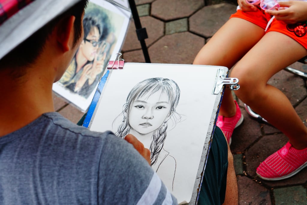
One of the first things you need to figure out is what kind of art style the comic will be in. While it can be easily argued that there are millions of different styles, the majority will break down to some variation of realistic or stylistic. For our purposes, the dividing line is determined by the emphasis on dynamism and musculature. While there are literally thousands of different markers we could look at, those three should do us well in their stead.
"Dynamism", in philosophy, is that matter and mind are due more to the action of forces rather than motion or matter; that is, the will is more important than the reality. In art, the style is more figurative and abstract than literal and concrete. That is, you see characters doing things that are physically impossible in the real world such as legs stretching for speed, characters being flattened, and using far more blood than they should be normally able to do so in real life.
In short, think something that you would see in a Bugs Bunny cartoon and you're pretty much there.
This style works great for not just silly cartoons but also body horror comics as well. If your action is going to be more over-the-top rather than outright cool, this is for you. Basically, if you're purposely exaggerating the human form, this is for you. However, note that this is not the same as super-hero comics; while some of the powers definitely qualify (such as super-stretching), you still want the form to be basically human. Unless you're going for satire or parody, superheroes do better when they are drawn to the limits of human appearance rather than well beyond it.
The key here is to what degree you plan on ignoring physics. If there are at least some physics in effect, even if those physics are straight out of a comic book, then the character is "realistic"; this means that even Superman and Spider-Man are realistic, as they still obey basic physics. "Stylistic" is more for characters that pause before falling, ignore panels, or just do things that ignore physics as we know them in real life with no real explanation.
"Musculature" looks at how the muscles and body in general are drawn, and yeah: It can get weird. If you're drawing accurate albeit exaggerated muscles, this is you, even if you aren't necessarily being detailed. However, this is a weird spectrum; realistic characters are in the center. Look at your characters in their underwear: If you're ignoring the muscles altogether or are giving them more muscles than a regular human should have, then it's stylistic, while characters with minimal to above-average muscles are still realistic.
This also applies to how those muscles work: If the muscles work like they would in real life, then you're probably still realistic. Drawing an animal as a humanoid with digitigrade legs, for example, is realistic while drawing it with straight legs would be more stylistic. Even monsters with tentacles or other stretchy parts can be considered more realistic if those parts thin out as they stretch out and have limits rather than just keep going forever. So obviously there is a lot of room for interpretation on this one, but the basic idea is that a realistic character's body looks and acts like it would in the real world, no matter how weird it may actually be.
In short, if the characters tend to look like they could step into the Real World and no one would really notice, or at least no biologist or physicist would be too put out by them, they are realistic. If they would have issues dealing with reality, then they are more stylistic. And yes: You can have a basically realistic comic with some stylistic characters, or even a stylistic comic with some realistic features; this explains Deadpool and the Doom Patrol on one hand and characters like Granny (Tweety and Sylvester's owner) on the other.
Oh, and debate going fully stylistic: If you get too far from realistic, then you're likely going to alienate your readers. They need something to relate to; Tables, flowers, and other background elements should at least conform to common definitions even if you're drawing them at the fringes. Look at what the reality-warping Dr. Seuss and Windsor McKay were capable of and try to keep on this side of things. If you get too far on the other side, then readers stop relating to your comic and it's practically just random squiggles: The more stylistic you get, the more reason you need to have for what you are doing for it to work.
Realism is Easier
With stylistic character, you have no real-world models; you are constantly making things up as you go along. With realistic characters, however, you can research appearances and have reasons for why characters look a particular way. This means things like animals being transformed into humanoids with digitigrade legs, how claws work, and even how wrinkles work. In short, a lot of the work has already been done for you; you just need to do the research and look at the right photos.
Stylistic is More Fun
However, stylistic does allow you to ignore the rules or even create your own as you go. Do you want bunny people that look human except for the ears and nose? Go for it! Ignore noses in all but profiles? Cool! Characters that have the anatomy of a Ken doll? Not a problem. Drawing more stylistically allows you to have fun with your characters, and draw them as you feel that they need to be drawn to have the most possible effect in your comic, even if there is no way that those fangs would fit in a mouth like THAT, or even allow the creature to speak or growl; just do what works in the moment.
Realism is Dark & Gritty
Nothing shatters the noirish feeling of a comic like spraying blood. Dark & gritty comics require a more realistic style; it just gives them that additional hint of danger that bones coming out of the ends of cut-off limbs don't seem to have. Drawing it more realistically ends up upping the stakes because we know intuitively how much damage a human body can take; remove that and it diminishes the stakes because we have no idea how much damage it takes to kill off a cartoon character. In short, the known limits of a realistic character add an extra edge that a more stylistic character just doesn't have.
Stylistic Has a Better Flow
Once you understand the difference between stretching and foreshortening, stylistic characters help the flow of the drawing. They can stretch towards a goal, even becoming thinner and longer to emphasize their speed. When they stop, they literally stop flat. Crowd scenes? They can flow into each other to become one huge monster and separate as needed. They can even change clothes as needed to make a scene work better, such as goth clothes in one panel and shorts in the next without losing a beat. Because you're not as interested in drawing the characters as truly real, they give you access to a lot of great visual shortcuts.
Realism is Better for Tech
Technology will always be a weird one. However, no matter how much fun you are having with the technology, it still needs to be drawn with the idea that form follows function; even James Bond's gear follows some basic rules. And could you imagine how far flat a Rube Goldberg string of devices would fall if they stopped acting realistically? This is not to say that you can't have some fun with the concept every so often, just that technology that doesn't work as expected creates a dissonance in the work that can kill your comic unless you have a reason: Guns needs to shoot, bombs need to blow up, and scanners need to detect, or your readers lose that necessary grounding.
Stylistic Makes a Point
The best part about a stylistic comic is that you can morph everyone to make a point and it still works. If you decide to add fangs and glowing eyes to everyone for a panel to emphasize the dread you need, it works; people expect a certain degree of weirdness. If you were doing a more realistic comic, you would need to rely on shadows alone to make the point. As such, if you want random flowers to show up to emphasize happiness, big hearts for love, and daggers for hatred without using hallucinations, stylism may be a better option for you.
Realism Ages Faster
One major problem with realistic comics is that you need to show the effects of time at some point. It's just that you need to show the passage of time and that time has some effect; it doesn't matter if this is something as basic as birthdays or as extreme as having kids grow up over time, but you need to have some aspect of time present itself, even if it's something like "sliding time". Just try to avoid de-aging the characters too often; the passage of time is needed to give the comic some reality, and thus ground it somewhat. And, yes: This applies even if your characters are unaging immortals.
Stylistic Has Too Many Tropes
One of the problems with taking a stylistic approach is that visual tropes take on greater importance. The reason is just that you need to relate it more to what your readers are expecting and that means relying on the standard set of visual symbols, or at least establishing motifs. Either way, it means that you need to rely on some sort of tropes at least for the sake of consistency and readability, even if you create them yourself. Okay, so more fun but more work; just something to consider.
Realism Isn't Always More "Serious"
The assumption is that realistically drawn comics tend to be more serious due to the lack of stylistic elements. The reality is that this is hardly the case; most comedy and slice-of-life manga would technically land on the "realistic" side of the spectrum. For that matter, most comedy comics tend to be drawn more realistically; it just seems to work out a lot better than relying on more surreal elements. Conversely, sometimes you need to draw it more stylistically in order to bring out the more serious elements.
Stylistic is Not Just For Kids
You also have those that consider more stylistic comics as written by more kids, or at least older adolescents. That is, there is little literary value as these comics are usually drawn simplistically for kids or overly stylistic in order to emphasize the bodies of its characters, or just a little too gory; all of that equates to a lack of literary value. That is obviously not always the case, especially given the amount of fun Grant Morrison has had with the concept. Just draw it in the way you think it works best for the comic and let the readers deal with it.
* * * * *
Obviously, once you have decided on a style, you do not need to stick to it. Sometimes you need some stylistic touches to make a horror comic work, especially for shadows and such, while sometimes adding some realism to a stylistic comic can actually add to the surrealism. The only catch is that your stylistic comics need to have some sort of grounding in reality; tech needs to work as reasonably expected, tables and chairs need to look at least sort of like tables and chairs, and there needs to be some physics. Otherwise, your readers will have nothing to relate to in your comic and it loses a lot of the effect you were going for.
But…don't feel that you need to be 100% real or 100% style; think of this as more a spectrum that you need to be somewhere in the middle of and you should do great. You should not feel that you need to outdo Grant Morrison or Alex Toth; just figure out where you are on that spectrum and stick there. This decision is more about consistency than a hard choice; your best bet to keeping readers is keeping consistent, and this is one of the weird areas you need to seriously think about before heading in.
About the Creator
Jamais Jochim
I'm the guy who knows every last fact about Spider-man and if I don't I'll track it down. I love bad movies, enjoy table-top gaming, and probably would drive you crazy if you weren't ready for it.
Keep reading
More stories from Jamais Jochim and writers in Art and other communities.
You're Not An Impostor
All writers, no matter how good or bad we are, tend to go through some phase where we think we're basically some sort of impostor, where it feels like we're an alien who's been sent here to record the human race, and figure out exactly what the human condition is all about. And because of that, well, we're fully expecting somebody to come over to us and rip off our rubber mask and expose us for the alien that we are.
By Jamais Jochimabout a year ago in Art
The Bookstore Encounter
Ella had always loved bookstores. The smell of old pages, the soft rustle of turning leaves, and the quiet corners where one could lose track of time made her feel at peace. One Saturday afternoon, she wandered into a small, tucked-away bookstore she had never noticed before. As she browsed the shelves, she noticed someone sitting cross-legged on the floor, completely absorbed in a thick novel. His hair fell slightly over his eyes, and he wore a gentle, contented smile. Something about him drew her closer, even though she couldn’t explain why.
By Sudais Zakwan2 days ago in Art


Comments
There are no comments for this story
Be the first to respond and start the conversation.